Playground S6E2 EDA: Statistical Insights and Modeling Guidance
Predicting Heart Disease with EDA (Playground S6E2)
The full EDA notebook is available on Kaggle:
https://www.kaggle.com/code/pilkwang/eda-statistical-insight-modeling-guidance
This post is a blog-friendly walkthrough of the entire EDA code, written for beginners.
TL;DR
- Dataset scale:
train 630,000 x 15,test 270,000 x 14 - Train class balance:
Absence 55.17%,Presence 44.83% - Data quality: no missing values, no duplicate feature rows
- Drift signal: very low numeric drift (KS max reported around
0.0026) - Strong numerical features:
Max HR,ST depression,Age - Strong categorical features:
Thallium,Chest pain type,Number of vessels fluro,Exercise angina
Notebook Roadmap
The notebook is organized into 6 parts:
- Setup and preprocessing
- Data quality checks
- Drift and distribution analysis
- Bivariate feature-vs-target analysis
- Multivariate and interaction analysis
- Final modeling playbook
I will explain each section in this order.
0. Setup and Preprocessing
0.1 Imports and analysis utilities
Quick Notes (for beginners):
pandas/numpy: table and numeric operations used across all EDA steps.scipy.stats: statistical tests (e.g., KS, chi-square, correlation).
Show notebook code for this section
Reduced from original notebook: plotting style/palette config and display-format helpers were omitted.
1
2
3
4
5
6
7
8
9
import pandas as pd
import numpy as np
import matplotlib.pyplot as plt
import seaborn as sns
from scipy import stats
from scipy.stats import ks_2samp, pearsonr

pd.set_option('display.max_columns', None)
pd.set_option('display.precision', 3)
The notebook sets up:
- data stack:
pandas,numpy - plotting:
matplotlib,seaborn - stats:
scipy.stats - helper printers for consistent output blocks (
display_kv,display_notes)
This is not just style. Consistent reporting prevents missing important diagnostics.
0.2 Load train/test (and optional reference data)
Quick Notes (for beginners):
originaldataset is optional and used as a reference baseline, not mandatory training data.
Show notebook code for this section
Reduced from original notebook: verbose print/display blocks were omitted.
1
2
3
4
5
6
7
8
9
10
11
12
train = pd.read_csv('./train.csv')
test = pd.read_csv('./test.csv')

try:
    original = pd.read_csv('./Heart_Disease_Prediction.csv')
except FileNotFoundError:
    original = None

try:
    originalMod = pd.read_csv('./Heart_Disease_PredictionMod.csv')
except FileNotFoundError:
    originalMod = None
The notebook loads:
train.csvtest.csv- optional:
Heart_Disease_Prediction.csv - optional:
Heart_Disease_PredictionMod.csv
Why this setting matters:
- It gives an external anchor to compare class ratio and feature behavior.
0.3 Feature groups and target definition
Quick Notes (for beginners):
CATSvsNUMSsplit controls which statistical test/plot is appropriate for each feature type.
Show notebook code for this section
Reduced from original notebook: validation-report formatting lines were omitted.
1
2
3
4
5
6
7
8
9
10
11
12
TARGET = 'Heart Disease'
TARGET_BIN = 'target_bin'
ID_COL = 'id'

ignore_cols = [ID_COL, TARGET, TARGET_BIN]
train_cols = [c for c in train.columns if c not in ignore_cols]
test_cols = [c for c in test.columns if c not in ignore_cols]
assert set(train_cols) == set(test_cols)

CATS = ['Sex', 'Chest pain type', 'FBS over 120', 'EKG results',
        'Exercise angina', 'Slope of ST', 'Number of vessels fluro', 'Thallium']
NUMS = ['Age', 'BP', 'Cholesterol', 'Max HR', 'ST depression']
The target is Heart Disease, mapped to binary:
Absence -> 0Presence -> 1
Domain-driven feature typing:
- Numerical:
Age,BP,Cholesterol,Max HR,ST depression - Categorical:
Sex,Chest pain type,FBS over 120,EKG results,Exercise angina,Slope of ST,Number of vessels fluro,Thallium
0.4 Preprocessing logic
Quick Notes (for beginners):
astype("category")helps category-aware handling and prevents accidental numeric interpretation.TARGET_MAPstandardizes binary label encoding.
Show notebook code for this section
Reduced from original notebook: warning/report lines were omitted.
1
2
3
4
5
6
7
8
9
for df in [train, test] + ([original] if original is not None else []):
    for col in CATS:
        if col in df.columns:
            df[col] = df[col].astype('category')

TARGET_MAP = {'Absence': 0, 'Presence': 1}
train[TARGET_BIN] = train[TARGET].map(TARGET_MAP)
if original is not None and TARGET in original.columns:
    original[TARGET_BIN] = original[TARGET].map(TARGET_MAP)
Why this step matters:
- Category casting prevents treating medical code columns as continuous signals.
- Binary target mapping enables consistent statistical tests.
1. Data Quality Checks
1.1 Missing values
Quick Notes (for beginners):
- Missing-value checks identify whether imputation is needed before modeling.
Show notebook code for this section
Reduced from original notebook: styled-table visualization lines were omitted.
1
2
3
4
5
6
7
8
9
10
11
12
def check_missing_values(df):
    miss = df.isnull().sum()
    miss = miss[miss > 0]
    if miss.empty:
        return None
    return pd.DataFrame({
        'Missing_Count': miss.values,
        'Missing_Percentage': (miss.values / len(df)) * 100
    }, index=miss.index)

train_missing = check_missing_values(train)
test_missing = check_missing_values(test)
Result: no missing values in train/test (and reference if loaded).
Practical impact:
- No imputation needed.
- Less preprocessing uncertainty.
1.2 Duplicate feature rows
Quick Notes (for beginners):
- Duplicate feature rows can inflate validation scores if not detected.
Show notebook code for this section
Reduced from original notebook: sample-display and reporting lines were omitted.
1
2
3
4
5
6
7
8
9
def check_duplicates(df, id_col=None, target_col=None):
    exclude = [c for c in [id_col, target_col] if c in df.columns]
    cols = [c for c in df.columns if c not in exclude]
    dup_extra = int(df.duplicated(subset=cols, keep='first').sum())
    dup_any = int(df.duplicated(subset=cols, keep=False).sum())
    return dup_extra, dup_any

dup_train = check_duplicates(train, id_col=ID_COL, target_col=TARGET)
dup_test = check_duplicates(test, id_col=ID_COL, target_col=TARGET)
The notebook checks duplicates using feature columns (excluding id/target).
Result: no duplicate feature sets.
Practical impact:
- Lower risk of redundancy-driven metric inflation.
1.3 Cardinality / unique values
Quick Notes (for beginners):
- Cardinality indicates whether a feature behaves like a dense numeric variable or coded category.
Show notebook code for this section
Reduced from original notebook: gradient styling and warning-format lines were omitted.
1
2
3
4
5
6
7
8
9
10
def check_unique_values(train_df, test_df, features, original_df=None):
    out = pd.DataFrame({
        'Dtype': train_df[features].dtypes,
        'Train_Unique': train_df[features].nunique(),
        'Test_Unique': test_df[features].nunique()
    })
    if original_df is not None:
        out['Original_Unique'] = original_df.reindex(columns=features).nunique()
    out['Cardinality_Ratio(%)'] = (out['Train_Unique'] / len(train_df)) * 100
    return out.sort_values('Train_Unique')
Outcome summary:
- Numerical columns have enough spread.
- Categorical columns follow low-cardinality clinical coding patterns.
Practical impact:
- Mixed modeling strategy is valid: numeric splits + categorical-aware handling.
2. Drift and Distribution Analysis
This section checks whether train and test are statistically aligned.
2.1 Target prior shift
Quick Notes (for beginners):
- Comparing class ratio across datasets helps detect prior shift before training.
Show notebook code for this section
Reduced from original notebook: figure styling/annotation details were omitted.
1
2
3
4
5
6
7
8
def target_balance(df, target_col='Heart Disease'):
    cnt = df[target_col].value_counts().reindex(['Absence', 'Presence']).fillna(0)
    pct = (cnt / cnt.sum()) * 100
    return cnt, pct

train_cnt, train_pct = target_balance(train, TARGET)
if original is not None:
    orig_cnt, orig_pct = target_balance(original, TARGET)
The notebook compares class proportions between train and reference.
Reported class summary includes:
- Train:
Absence 55.166%,Presence 44.834% - Original:
Absence 55.556%,Presence 44.444%
Interpretation and takeaway:
- Prior shift appears small.
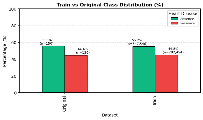
Figure 1. Train and reference class proportions are closely aligned.
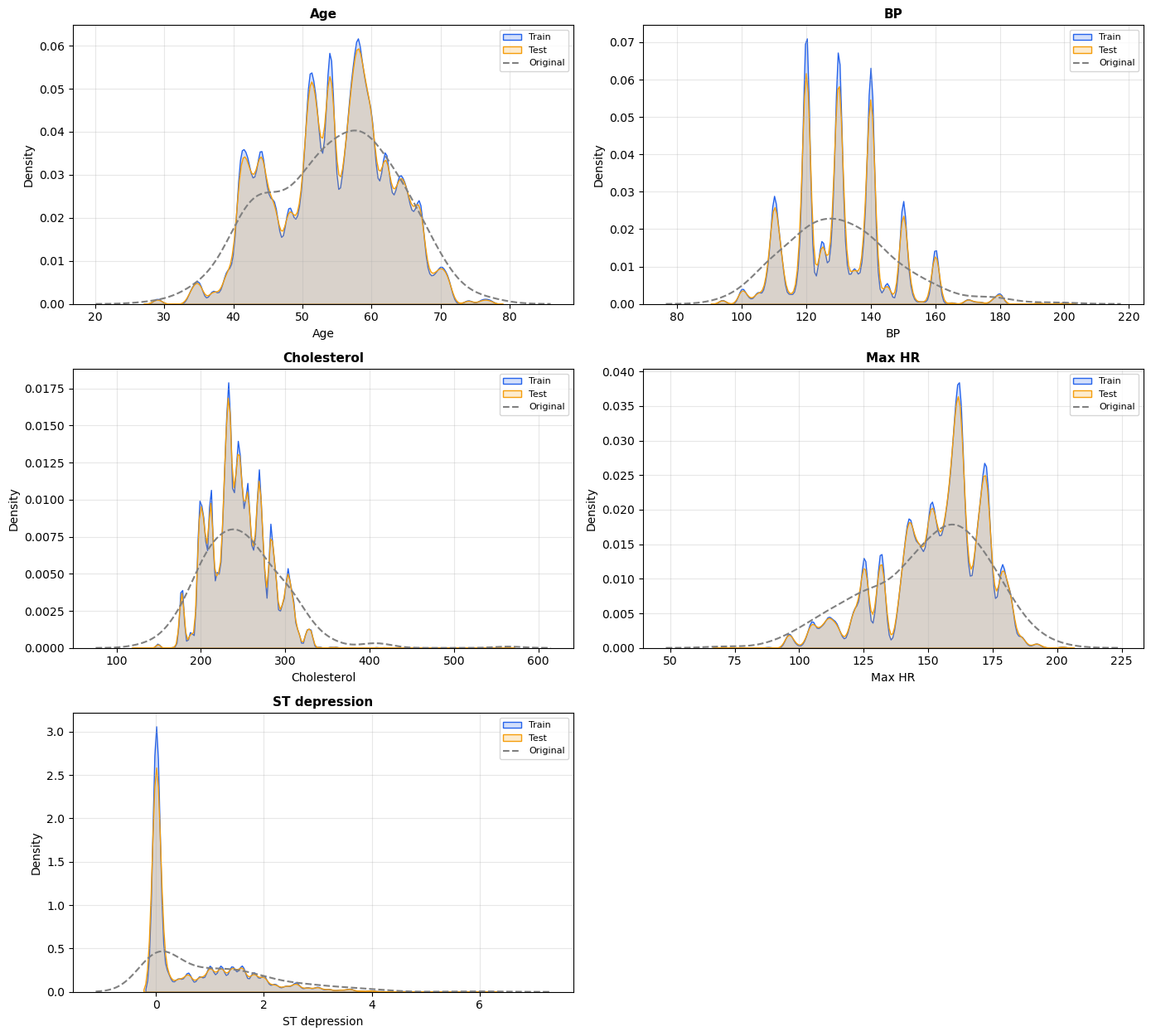
2.2 Numeric summary / density / outliers
Quick Notes (for beginners):
skew/kurtosissummarize shape; boxplot/IQR helps detect tail behavior and outliers.
Show notebook code for this section
Reduced from original notebook: plot cosmetics (palette/labels/grids/fonts) were omitted.
1
2
3
4
5
6
7
8
9
10
11
12
# 1) Statistical summary
summary = train[NUMS].describe().T[['mean', 'std', '50%']]
summary['skew'] = train[NUMS].skew()
summary['kurt'] = train[NUMS].kurt()

# 2) Outlier profile (IQR rule)
outlier_rows = []
for c in NUMS:
    q1, q3 = train[c].quantile([0.25, 0.75])
    iqr = q3 - q1
    mask = (train[c] < q1 - 1.5*iqr) | (train[c] > q3 + 1.5*iqr)
    outlier_rows.append((c, int(mask.sum()), float(mask.mean()*100)))
The notebook compares central tendency and tails using:
- descriptive statistics
- KDE overlays
- boxplots
- skewness / kurtosis / Jarque-Bera normality diagnostics
Interpretation and takeaway:
- Non-normality exists, but this is expected in medical tabular data.
- Tree boosting is generally robust to this setting.
Detailed distribution and outlier charts are provided in the supplementary section at the end.
2.3 KS drift test (shape difference)
Quick Notes (for beginners):
ks_2sampcompares full distribution shape, not only mean difference.
Show notebook code for this section
Reduced from original notebook: barplot styling/threshold-label cosmetics were omitted.
1
2
3
4
5
6
7
ks_results = []
for col in NUMS:
    if col in test.columns:
        stat, p = ks_2samp(train[col], test[col])
        ks_results.append({'Feature': col, 'KS_Statistic': stat, 'P_Value': p})

ks_drift_df = pd.DataFrame(ks_results).sort_values('KS_Statistic', ascending=False)
The notebook computes Kolmogorov-Smirnov per numeric feature:
\[D = \sup_x \left|F_{train}(x)-F_{test}(x)\right|\]Notebook-level conclusion:
- KS values are very small overall.
- Final note reports
KS max=0.0026, indicating low covariate-shift risk.
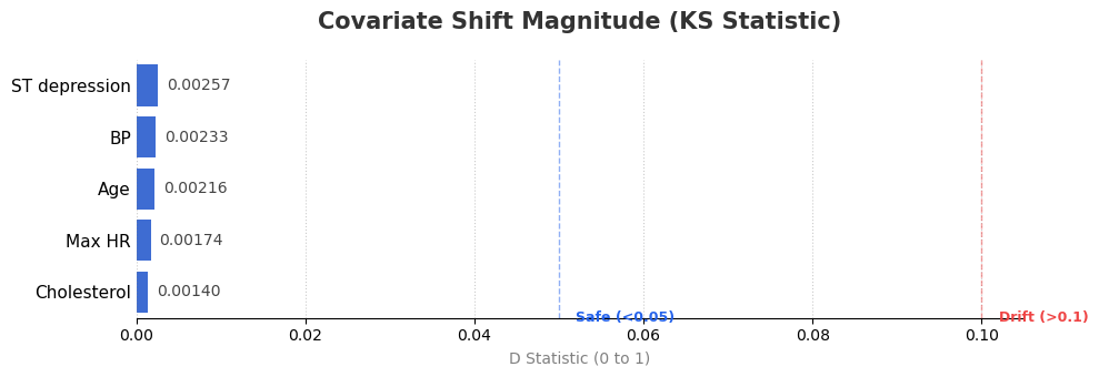
Figure 2. KS statistic by numerical feature (lower is better).
2.4 SMD drift check (mean shift)
Quick Notes (for beginners):
SMD(standardized mean difference) measures mean shift scaled by pooled variance.
Show notebook code for this section
Reduced from original notebook: styled-display and alert-format lines were omitted.
1
2
3
4
5
6
7
8
9
common = [c for c in NUMS if c in train.columns and c in test.columns]
tr = train[common].agg(['mean', 'std']).T
te = test[common].agg(['mean', 'std']).T

diff = (tr['mean'] - te['mean']).abs()
pooled = np.sqrt((tr['std']**2 + te['std']**2) / 2)
smd = diff / pooled

smd_drift_df = pd.DataFrame({'SMD (Sigma)': smd}).sort_values('SMD (Sigma)', ascending=False)
The notebook also computes Standardized Mean Difference:
\[\text{SMD} = \frac{|\mu_{train}-\mu_{test}|}{\sqrt{\frac{\sigma_{train}^2+\sigma_{test}^2}{2}}}\]Common interpretation used in the notebook:
< 0.1: negligible> 0.1: small but monitor> 0.2: noticeable
Why both KS and SMD?
- KS checks full distribution shape.
- SMD checks location (mean) shift.
- Using both reduces blind spots.
2.5 Categorical distribution comparison
Quick Notes (for beginners):
- Category proportion comparison checks structural drift in coded features.
Show notebook code for this section
Reduced from original notebook: grouped-bar chart styling and axis cosmetics were omitted.
1
2
3
4
5
6
7
8
9
def category_percent(df, col):
    return df[col].value_counts(normalize=True).sort_index() * 100

cat_compare = {}
for c in CATS:
    cat_compare[c] = {
        'train_pct': category_percent(train, c),
        'test_pct': category_percent(test, c)
    }
The notebook normalizes category counts to percentages and compares:
- Train vs Test vs Original
Interpretation and takeaway:
- Category composition is broadly stable.
- Continue monitoring category-level drift in production.
The full categorical distribution comparison chart is included in the supplementary section.
3. Bivariate Analysis: Feature vs Target
This section asks: “Which single features carry signal?”
3.1 Numerical features vs target
Quick Notes (for beginners):
pearsonrhere is used as a point-biserial-style signal score for binary target vs numeric feature.
Show notebook code for this section
Reduced from original notebook: CI-plot styling and annotation text formatting were omitted.
1
2
3
4
5
6
7
corr_rows = []
for col in NUMS:
    temp = train[[col, TARGET_BIN]].dropna()
    r, p = pearsonr(temp[col], temp[TARGET_BIN])
    corr_rows.append({'Feature': col, 'r': r, 'p': p, 'abs_r': abs(r)})

corr_ranking = pd.DataFrame(corr_rows).sort_values('abs_r', ascending=False)
Method choices:
- quantile binning (
qcut) - bin-wise disease rate with 95% CI
- global baseline line
- Pearson/point-biserial style correlation ranking
Reported top numerical signals:
Max HR (r=-0.441)ST depression (r=0.431)Age (r=0.212)
Interpretation and takeaway:
|r|is moderate for top variables, useful but not sufficient alone.
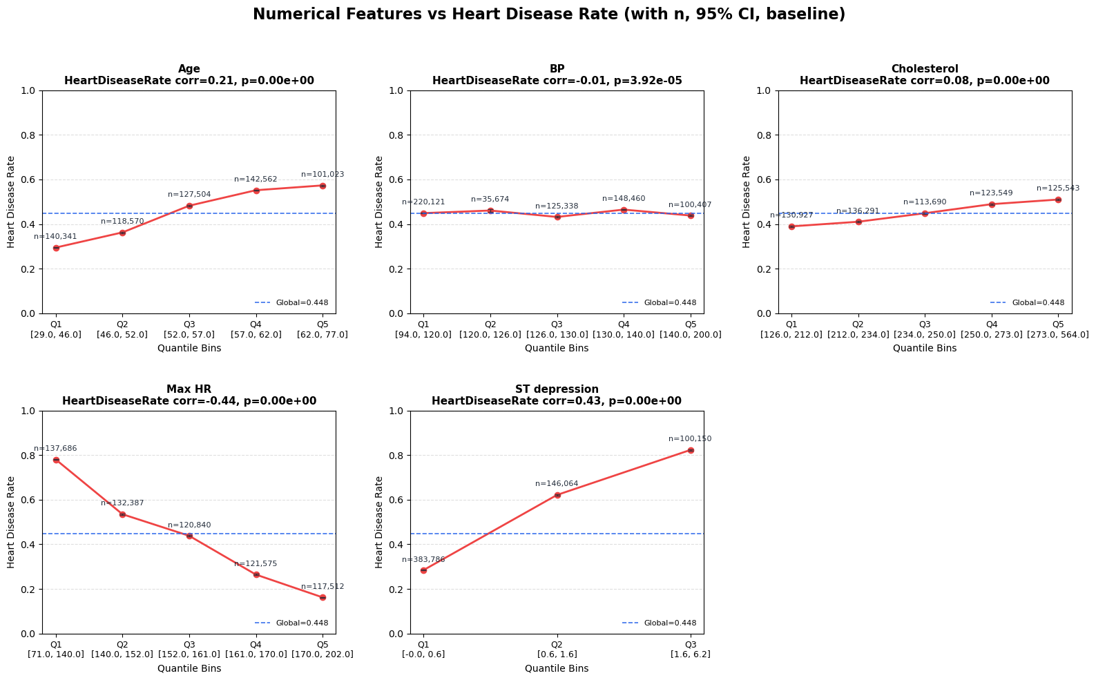
Figure 3. Heart disease rate across quantile bins of numerical features.
3.2 Categorical features vs target
Quick Notes (for beginners):
chi2_contingencytests association;Cramer's Vquantifies effect size.
Show notebook code for this section
Reduced from original notebook: bar chart styling/labeling lines were omitted.
1
2
3
4
5
6
7
8
9
10
11
effect_rows = []
for col in CATS:
    tmp = train[[col, TARGET]].dropna()
    ct = pd.crosstab(tmp[col], tmp[TARGET])
    chi2, p, _, _ = stats.chi2_contingency(ct)
    n = ct.to_numpy().sum()
    r, k = ct.shape
    v = np.sqrt((chi2 / n) / max(min(r - 1, k - 1), 1))
    effect_rows.append({'Feature': col, 'Cramers_V': v, 'P_Value': p})

cat_effect_df = pd.DataFrame(effect_rows).sort_values('Cramers_V', ascending=False)
Method choices:
- category-wise disease rate + 95% CI
- chi-square test
- Cramer’s V effect size
Cramer’s V formula:
\[V = \sqrt{\frac{\chi^2}{n\cdot\min(r-1, c-1)}}\]Reported strongest categorical features:
Thallium (0.606)Chest pain type (0.525)Number of vessels fluro (0.463)Exercise angina (0.442)
Interpretation and takeaway:
- Categorical medical-code features carry substantial predictive structure.
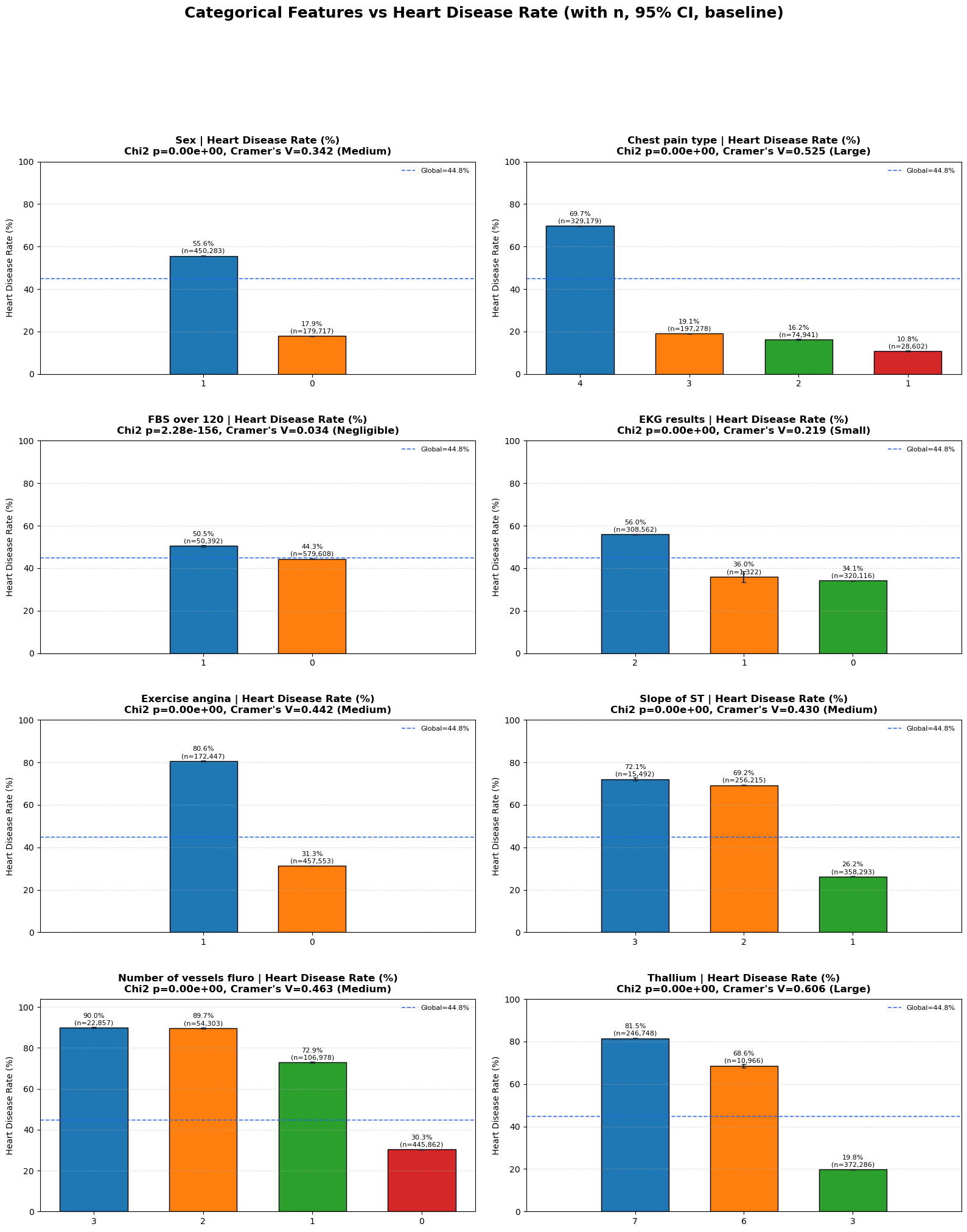
Figure 4. Heart disease rate by categorical feature levels.
4. Multivariate and Interaction Analysis
This section checks relationships between features, not only feature-to-target.
4.1 Correlation matrix
Quick Notes (for beginners):
- Correlation matrix is a quick check for pairwise linear dependency among numeric features.
Show notebook code for this section
Reduced from original notebook: heatmap style arguments (fmt, cmap, vmin/vmax, labels/fonts) were omitted.
1
2
3
4
5
6
7
8
9
10
corr_data = train[NUMS].select_dtypes(include=[np.number])
corr_matrix = corr_data.corr()

high_corr = []
cols = corr_matrix.columns
for i in range(len(cols)):
    for j in range(i + 1, len(cols)):
        r = corr_matrix.iloc[i, j]
        if abs(r) > 0.7:
            high_corr.append((cols[i], cols[j], r))
A standard Pearson heatmap is used for numeric features.
Interpretation and takeaway:
- Dependencies exist but not severe enough to block tree-based models.
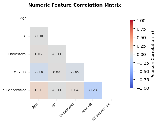
Figure 5. Pairwise correlation structure among numerical features.
4.2 VIF for redundancy
Quick Notes (for beginners):
VIFmeasures multicollinearity risk beyond pairwise correlation.
Show notebook code for this section
Reduced from original notebook: VIF table style/visual formatting lines were omitted.
1
2
3
4
5
6
7
8
9
10
11
12
13
14
15
x_df = train[NUMS].select_dtypes(include=[np.number]).dropna().copy()
X = x_df.values.astype(float)

rows = []
for i, col in enumerate(x_df.columns):
    y = X[:, i]
    Xo = np.delete(X, i, axis=1)
    Xd = np.column_stack([np.ones(len(Xo)), Xo])
    beta, *_ = np.linalg.lstsq(Xd, y, rcond=None)
    yhat = Xd @ beta
    r2 = 1 - (((y - yhat) ** 2).sum() / ((y - y.mean()) ** 2).sum())
    vif = 1.0 / (1.0 - min(max(r2, 0.0), 0.999999))
    rows.append({'Feature': col, 'VIF': vif})

vif_df = pd.DataFrame(rows).sort_values('VIF', ascending=False)
The notebook computes VIF manually via least squares.
Rule used in notebook:
VIF < 5: good5~10: watch>10: high collinearity risk
Why keep this for tree models too?
- Even when trees handle collinearity, redundancy can still hurt stability and interpretation.
4.3 Numeric pairwise interaction heatmaps
Quick Notes (for beginners):
- Pairwise heatmaps reveal non-additive risk patterns not visible in single-feature plots.
Show notebook code for this section
Reduced from original notebook: heatmap rendering cosmetics and axis-label styling were omitted.
1
2
3
4
5
6
7
8
9
10
11
12
13
num_pair_rows = []
chosen = corr_ranking['Feature'].tolist()[:3] if 'corr_ranking' in globals() else NUMS[:3]

for i in range(len(chosen)):
    for j in range(i + 1, len(chosen)):
        a, b = chosen[i], chosen[j]
        tmp = train[[a, b, TARGET_BIN]].dropna().copy()
        tmp[f'{a}_bin'] = pd.qcut(tmp[a], q=4, duplicates='drop')
        tmp[f'{b}_bin'] = pd.qcut(tmp[b], q=4, duplicates='drop')
        pivot = tmp.pivot_table(index=f'{a}_bin', columns=f'{b}_bin', values=TARGET_BIN, aggfunc='mean') * 100
        num_pair_rows.append({'Pair': f'{a} x {b}', 'Range(%)': float(pivot.max().max() - pivot.min().min())})

num_pair_df = pd.DataFrame(num_pair_rows).sort_values('Range(%)', ascending=False)
Method choices:
- choose top numerical features
- quantile-bin each pair
- plot disease-rate heatmap
- summarize max/min cell contrast
Interpretation and takeaway:
- Joint bins often show clearer risk separation than single-variable plots.
Figure 6. Numeric pairwise interactions reveal stronger joint risk contrasts.
4.4 Categorical pairwise interaction heatmaps
Quick Notes (for beginners):
- Category combinations can define discrete risk tiers even when single categories look moderate.
Show notebook code for this section
Reduced from original notebook: heatmap/bar annotation styling and chart cosmetics were omitted.
1
2
3
4
5
6
7
8
9
10
11
12
13
14
cat_pair_rows = []
chosen = cat_effect_df['Feature'].tolist()[:3] if 'cat_effect_df' in globals() else CATS[:3]

for i in range(len(chosen)):
    for j in range(i + 1, len(chosen)):
        a, b = chosen[i], chosen[j]
        tmp = train[[a, b, TARGET_BIN]].dropna().copy()
        combo = tmp.groupby([a, b], observed=True)[TARGET_BIN].agg(['mean', 'size']).reset_index()
        combo['rate'] = combo['mean'] * 100
        hi = combo.sort_values('rate', ascending=False).iloc[0]
        lo = combo.sort_values('rate', ascending=True).iloc[0]
        cat_pair_rows.append({'Pair': f'{a} x {b}', 'Gap(%)': float(hi['rate'] - lo['rate'])})

cat_pair_df = pd.DataFrame(cat_pair_rows).sort_values('Gap(%)', ascending=False)
Method choices:
- pair top categorical features
- compute cell-wise disease rates
- compare high-risk and low-risk combinations (with minimum count filter)
Interpretation and takeaway:
- Certain category combinations define clear risk tiers.
- Interaction-aware features are justified candidates.
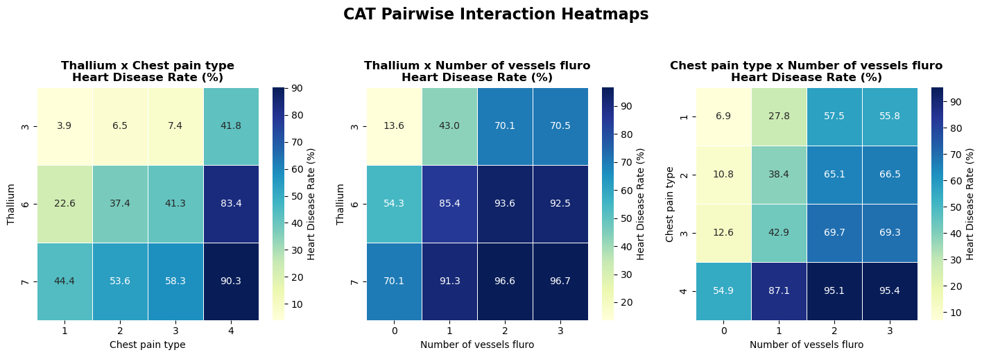
Figure 7. Categorical pair interactions and risk-zone separation.
5. Final Modeling Playbook from EDA
Quick Notes (for beginners):
- Final playbook translates statistical findings into training/validation policy choices.
Show notebook code for this section
Reduced from original notebook: verbose printing/report-rendering lines were omitted.
1
2
3
4
5
6
7
8
9
10
11
12
13
14
15
16
17
18
def final_playbook_from_eda(num_signal_df=None, cat_signal_df=None,
                            ks_df=None, smd_df=None,
                            num_pair_df=None, cat_pair_df=None):
    # 1) data quality summary
    # 2) drift summary (KS/SMD)
    # 3) top single-feature signals (numeric/categorical)
    # 4) top pairwise interaction signals
    # 5) final recommendation for validation/metric/model policy
    pass

final_playbook_from_eda(
    num_signal_df=corr_ranking,
    cat_signal_df=cat_effect_df,
    ks_df=ks_drift_df,
    smd_df=smd_drift_df if 'smd_drift_df' in globals() else None,
    num_pair_df=num_pair_df,
    cat_pair_df=cat_pair_df,
)
The final notebook section translates diagnostics into modeling actions.
Recommended strategy:
- Validation:
StratifiedKFold (5 folds)with fixed seeds - Main metric:
ROC-AUC - Secondary metrics:
PR-AUC, thresholdedF1 - Model order:
CatBoostfirst, thenLightGBM/XGBoost - Feature policy: keep medical code columns categorical
- Interaction policy: add only if CV gain is stable
- Monitoring: periodically recompute
KS/SMD
Why this is a good baseline for beginners:
- It is statistically grounded.
- It avoids premature complexity.
- It prioritizes reproducible validation.
Supplementary Figures
Open all supplementary figures
 Supplementary A. Numeric feature distributions across train, test, and reference.
 Supplementary B. Outlier and range comparison by dataset.
 Supplementary C. Category composition comparison between train/test/reference.
Practical Notes for Beginners
If a concept feels new, start here:
- EDA basics
- Kolmogorov-Smirnov test
- Effect size and Cohen’s d
- Cramer’s V
- ROC metrics in scikit-learn
- Stratified K-Fold
Final Takeaway
This EDA is strong because it combines:
- clean data checks,
- drift diagnostics,
- single-feature effect sizing,
- interaction-level structure, and
- a concrete modeling playbook.